

So you’re thinking about doing a bit of home renovation, but you’re unsure of what color palette to pick to make your home uniquely yours? Hey, we’ve all been there! Don’t worry, we’re here to make your life a lot easier with some tips and tricks, and even some color psychology. Yes, we’re going all the way!
Let’s start with a few designing tips. If you’re thinking about changing a whole room, you will be tempted to go straight for the paint and go all-in on those walls. DO NOT DO THAT. Paint is cheap and easily changeable, and choosing a color too soon might ruin your whole vibe. Instead, focus on the biggest pattern on the space. Maybe you have a big rug in the middle of the room or a colorful couch. That could be your base.
According to designer Mark McCauley, you should also go vertically from dark to light, from bottom to top. That means, use darker colors on the floors, mediums on walls, and lights on ceilings. He says this is to replicate the exterior in your interiors: "The exterior environment is generally darker below our feet, medium-valued as you look straight ahead, and lighter skyward.". Makes sense.

McCauley has another good strategy: the rule of 60-30-10: “Divide the colors into components of 60% of a dominant color (walls), 30% of a secondary color (upholstery), and 10% of an accent color (accessories) [...]. This ratio ensures that the colors are properly balanced and there's just enough pop for interest."
Now you have a good idea of how to choose your hues and tones and where to put them, but what should your base color be? Well, that’s your choice! If you need a bit of guidance in what you like best, take a look inside your closet: what color do you wear more? It’s probably because you like it a lot. If you’re going for a specific feel, this is where color psychology comes in.

Although color meaning and feelings associated with them can be deeply personal, for years, from artists to marketers, and, of course, designers, have believed that colors can affect our moods. These are the most common moods associated with colors.
BLACK: Although a lot of people associate black with sadness or emptiness (it IS the total absence of light in the end), it’s also perceived as bold, formal, mysterious, strong, serious, and even luxurious.
WHITE: On the other end, we have white. Let all the light in! White is usually associated with purity, cleanliness, freshness, and simplicity, although, too much of it can make a space feel cold and empty.
RED: According to o color psychology, red is the color that causes the strongest emotions: from love and passion to anger and power. Although it’s thought to be a color that conveys excitement and energy, people also tend to associate red with danger (think of stop signs or ambulance lights). Some even believe that it stimulates your appetite, so maybe don’t use it a lot in your kitchen if you’re trying keto for the first time.
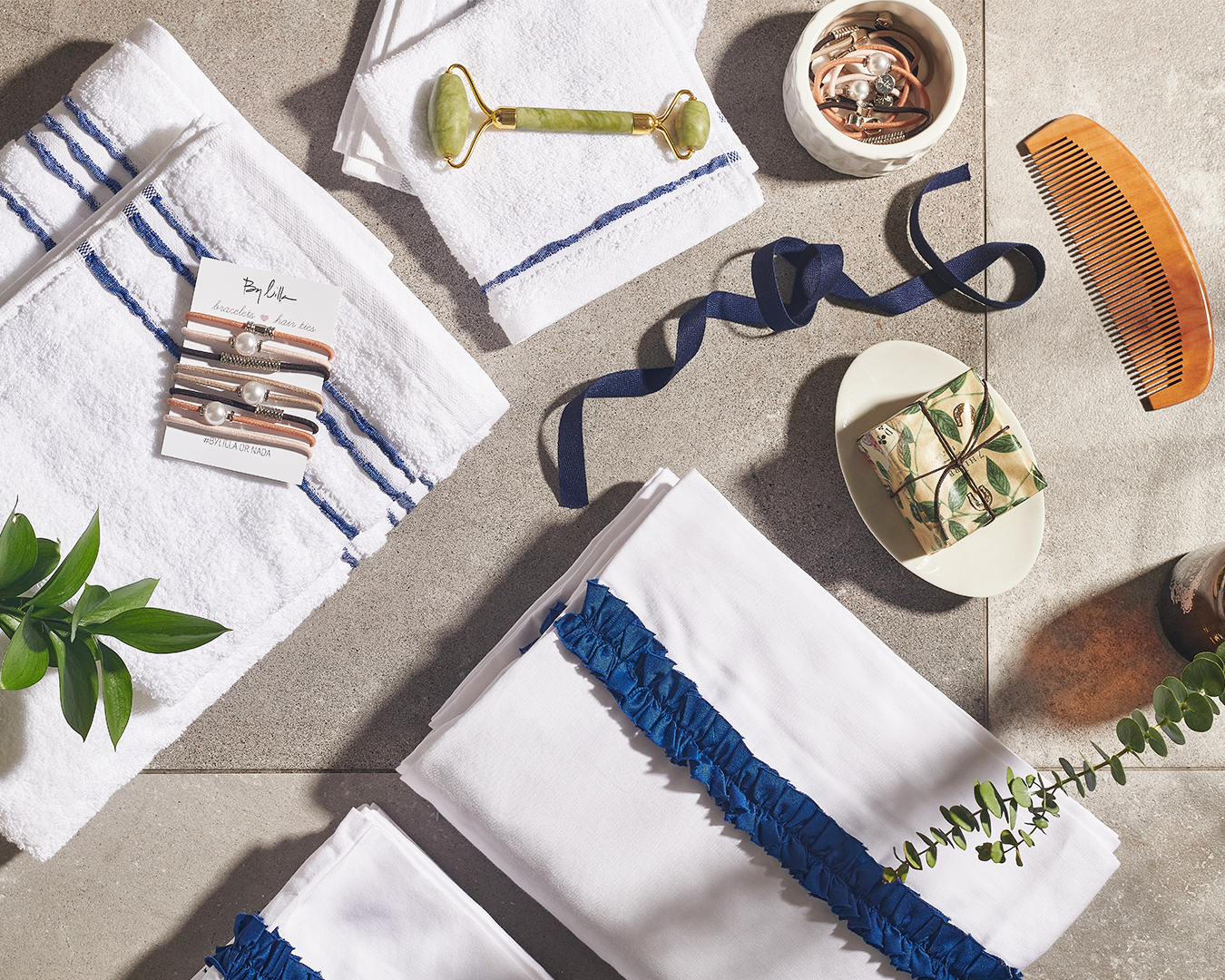
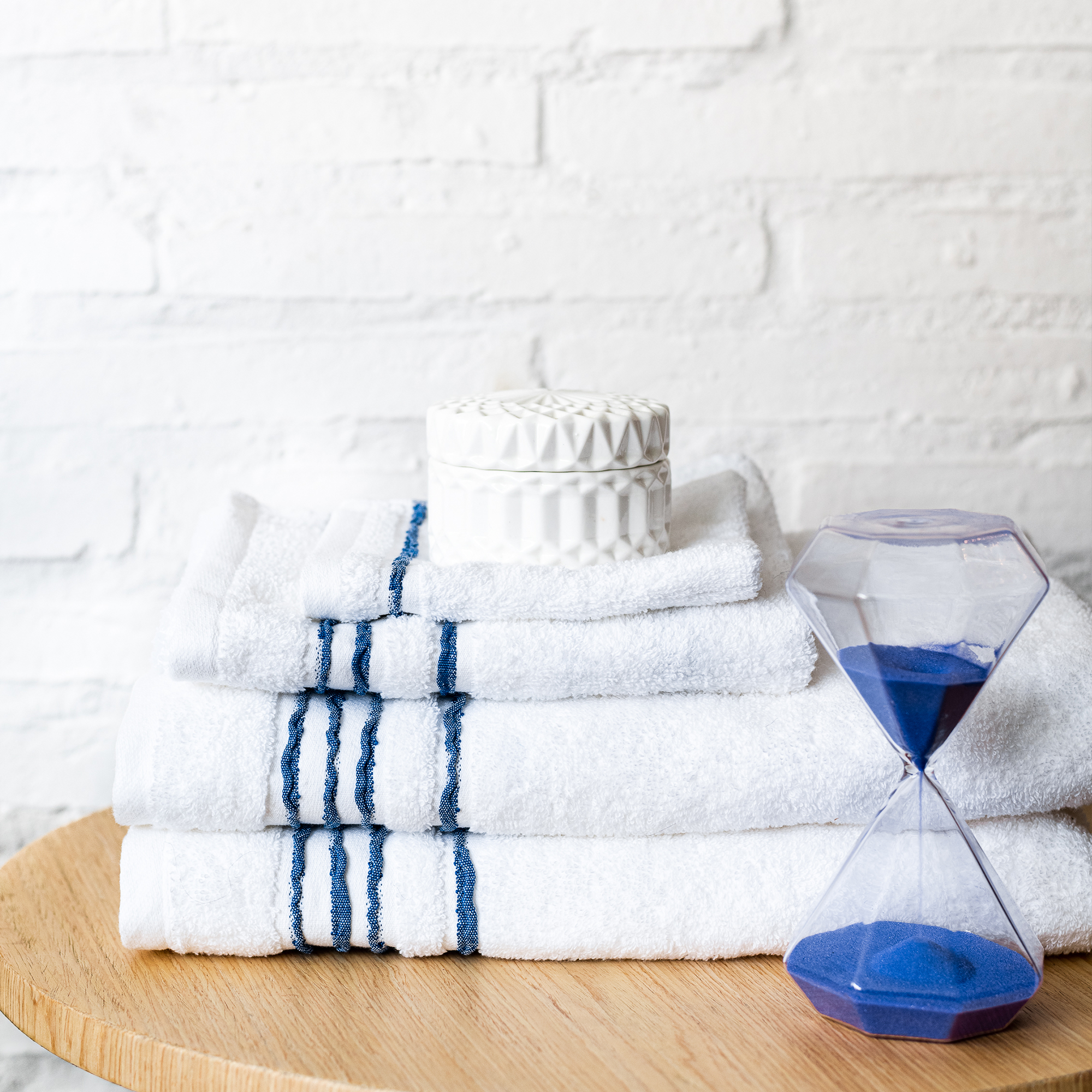
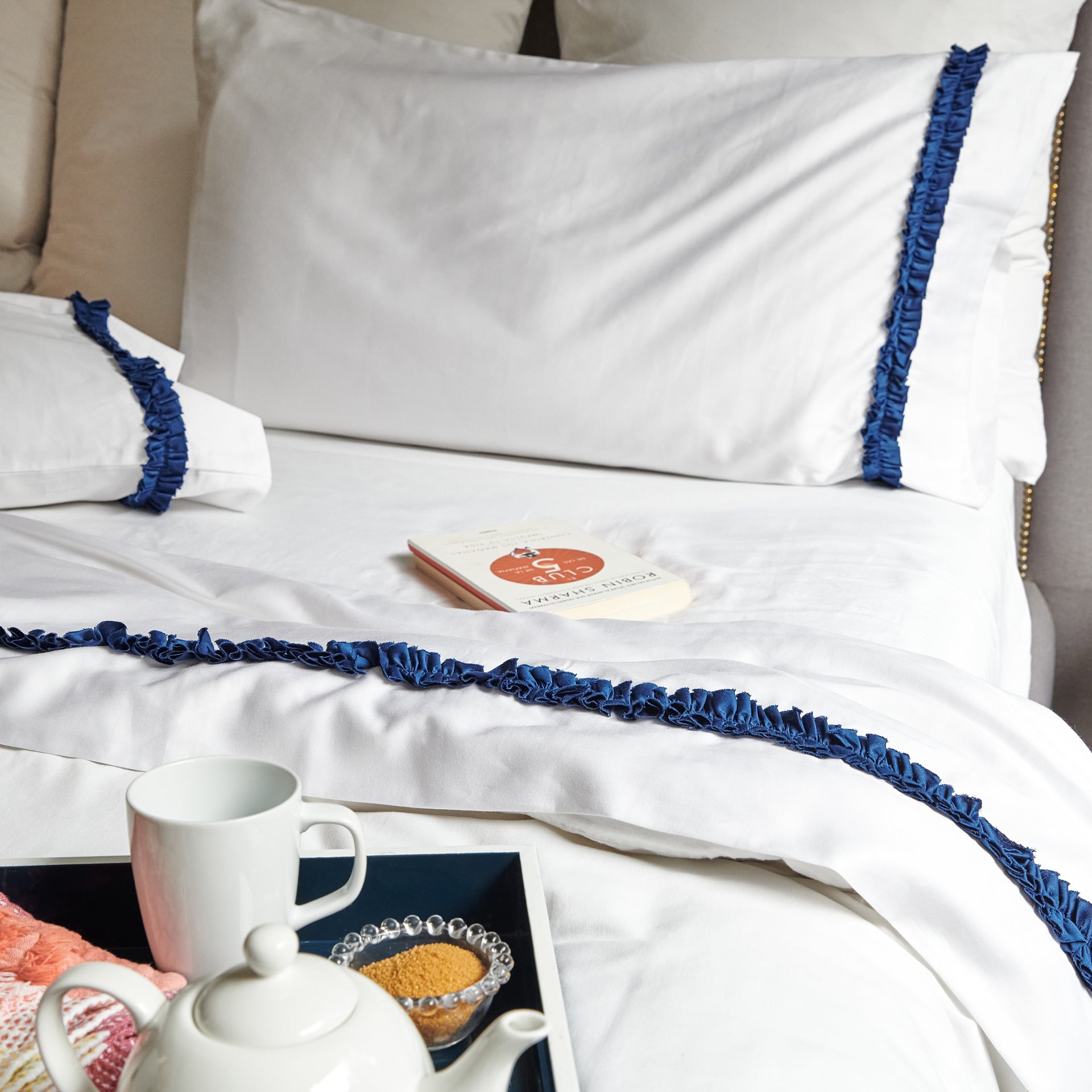
BLUE: We tend to say we’re feeling blue when things are not going so well, but this color has so much more meaning behind it. Yes, sadness, coldness, and aloofness can be associated with the color blue, but it's favored by a lot of people because it is calming, relaxing, and serene. Some studies have shown that people tend to be more productive in blue rooms, and also, less hungry!

GREEN: Most people think of green when it comes to nature, which makes it a very fresh and tranquil color. Green is often associated with health and good luck, and some studies even show that people who work in green environments, tend to get fewer stomach aches, but it’s also thought of to be the color of jealousy and envy. One good thing though, is that green has been shown to improve reading comprehension and speed.
YELLOW: Yellow is often thought of as the color of happiness: it’s energetic, bright, attention-grabbing, and warm, but it’s also a color that can bee evoke frustration. The overuse of yellow can become abrasive and lead to visual fatigue.
PURPLE: Purple tends to be a color associated with spirituality, imagination, mystery, and luxury. It is often thought of to be the color of royalty, too. Purple is also thought to be a sensual color.
So, now that you know all of this, what palette will you choose for your home? Whichever you end up with, don’t worry, we got you covered! Mix & Match from all of our Sttelli collections to get the perfect aesthetic for your style.